Developed by Siamo Studio / Art Direction: Ana Megda / Graphic Design: Ana Dornelles
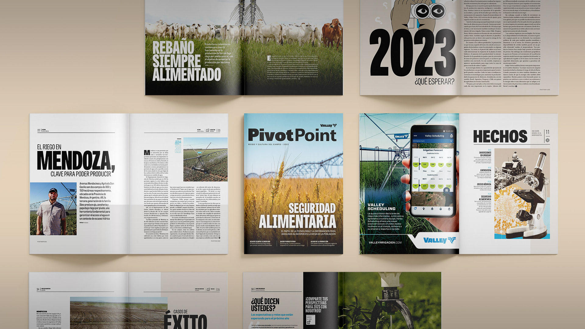
A revista customizada Pivot Point é uma iniciativa da Valley, líder global em sistemas de irrigação de precisão, para dialogar com o público do agronegócio.
A publicação é parte de uma estratégia de relacionamento e construção de marca entre os representantes (Dealers) e seus clientes. Com o passar dos anos, ela tornou-se um referência em seu segmento, por entregar uma proposta de valor consistente e orientada ao leitor.
Sua linha editorial atua como uma ponte entre conteúdos de qualidade e relevância e produtores rurais em busca de conhecimento para impulsionar seus negócios por meio de tecnologia, ciência e boas práticas.
Neste novo projeto gráfico desenvolvido pelo Siamo Studio, o principal enfoque foi modernizar a linguagem e recursos visuais da publicação, conferindo maior conexão com a personalidade da marca e seus conteúdos.
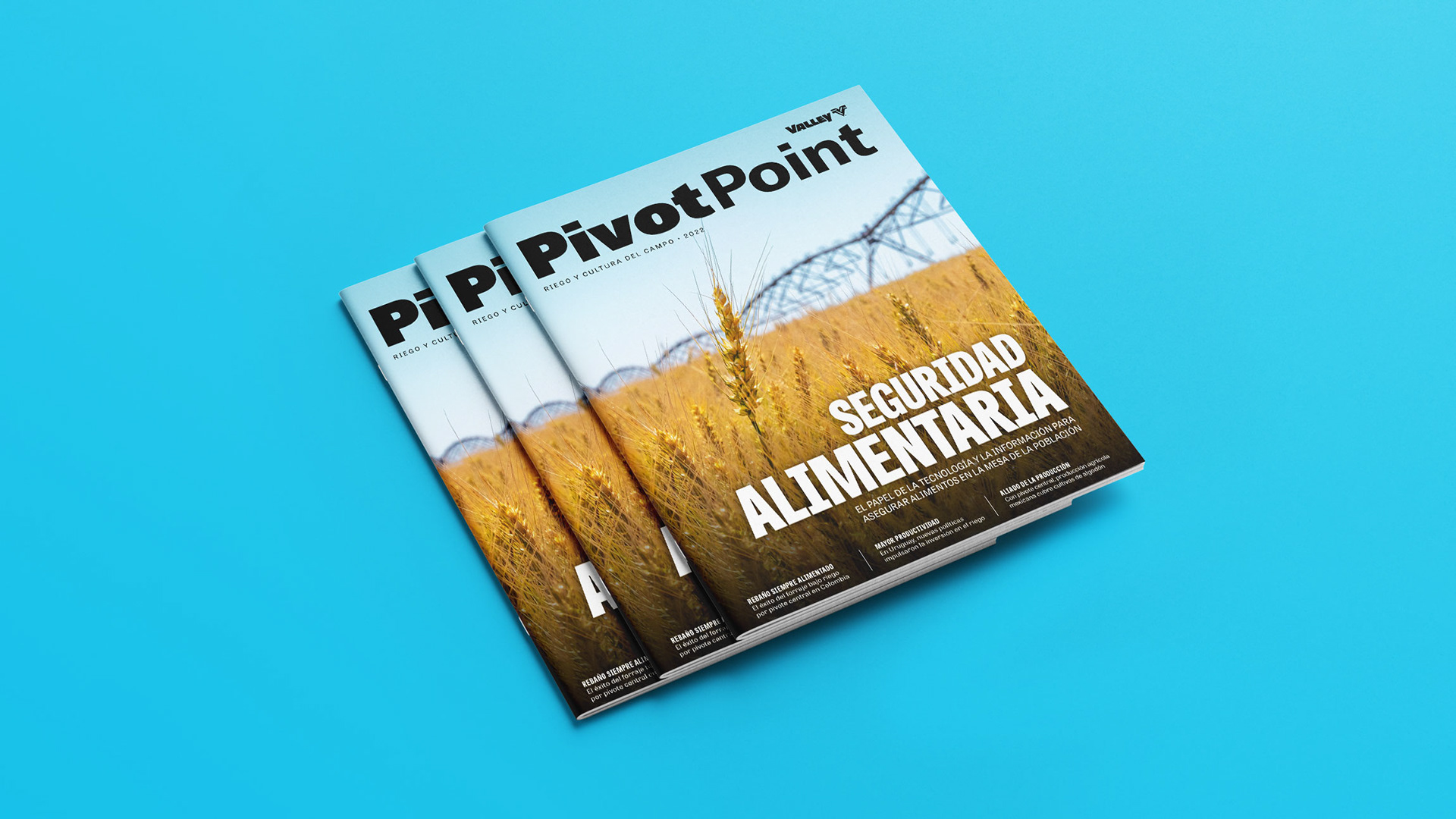
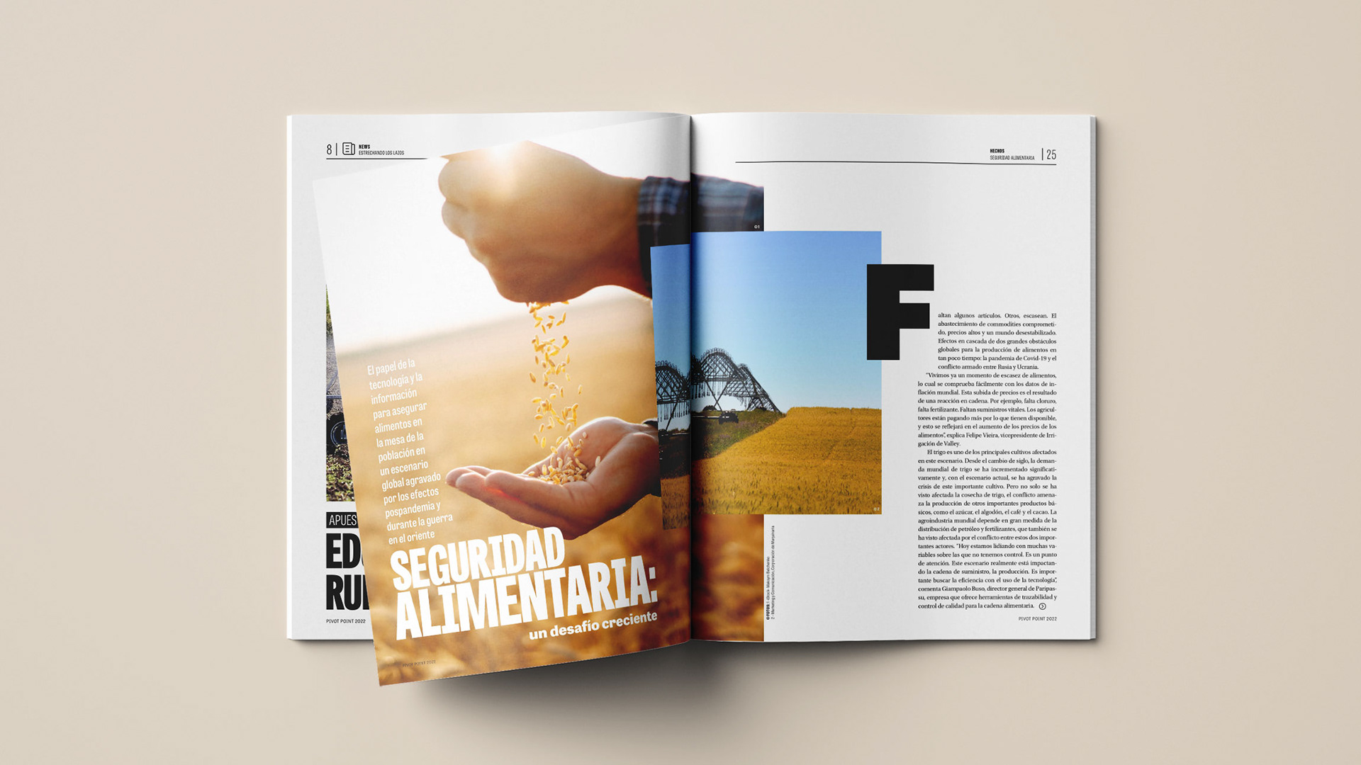
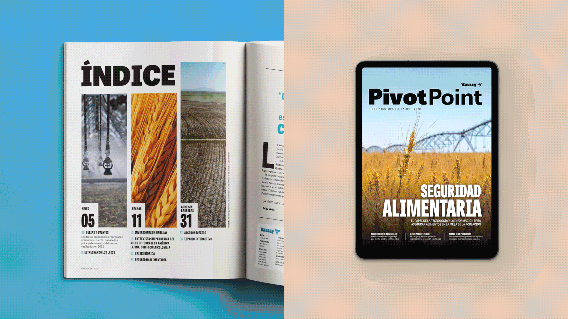
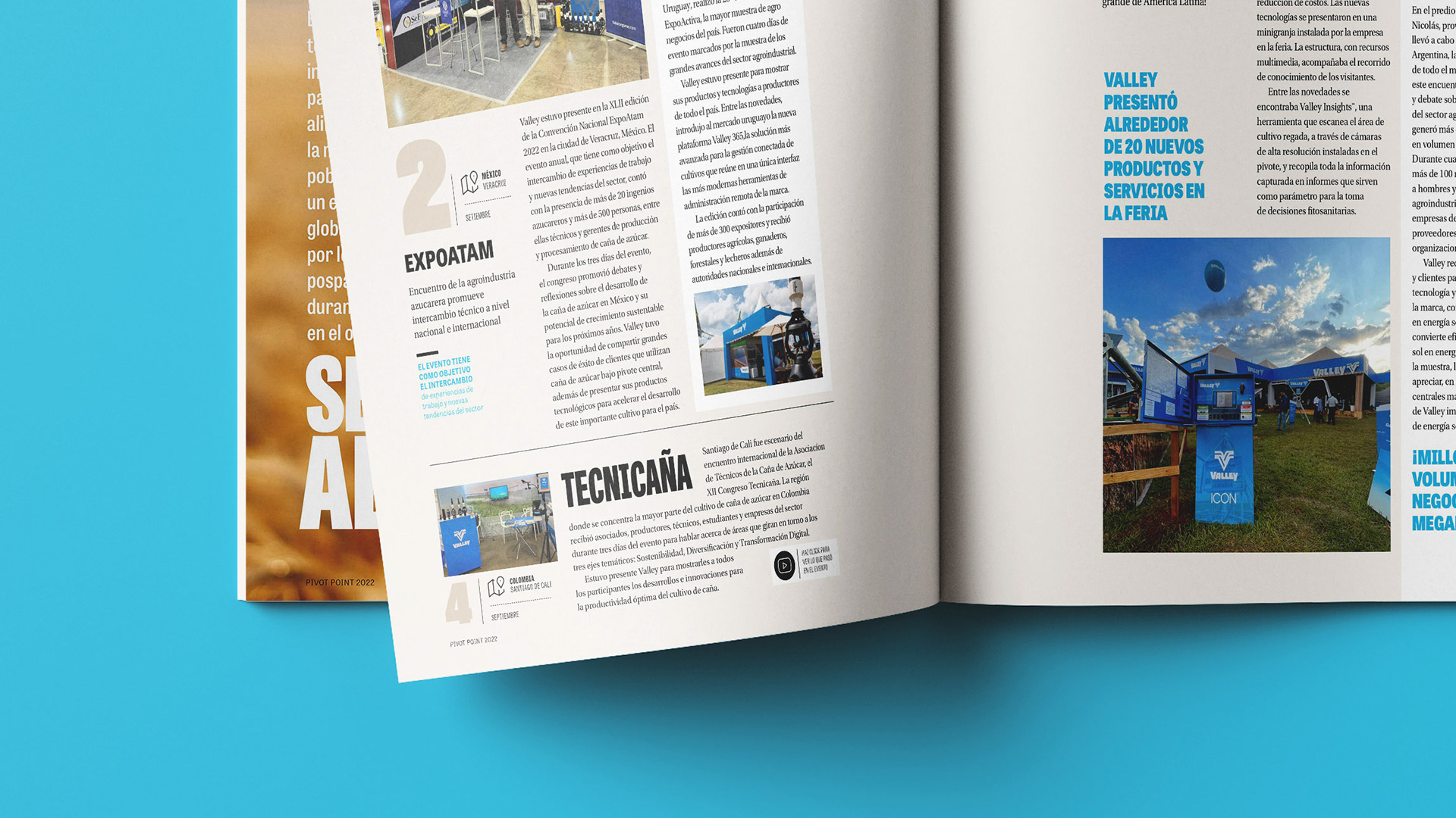
O projeto de capa busca valorizar a beleza das produções fotográficas que apresentam contextos reais de utilização dos produtos no campo, protagonizados por clientes reais, com um uso marcante de recursos tipográficos.
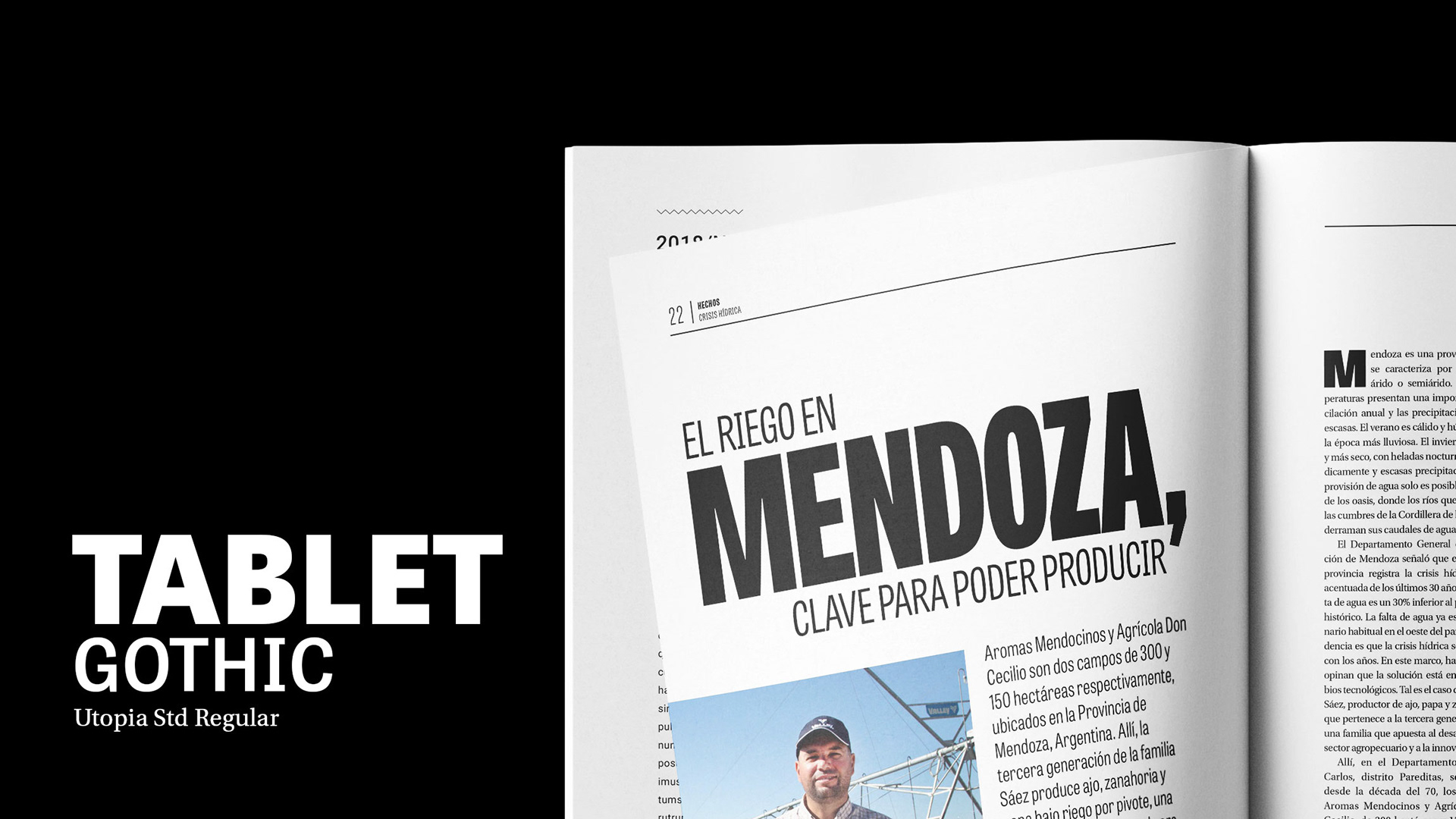
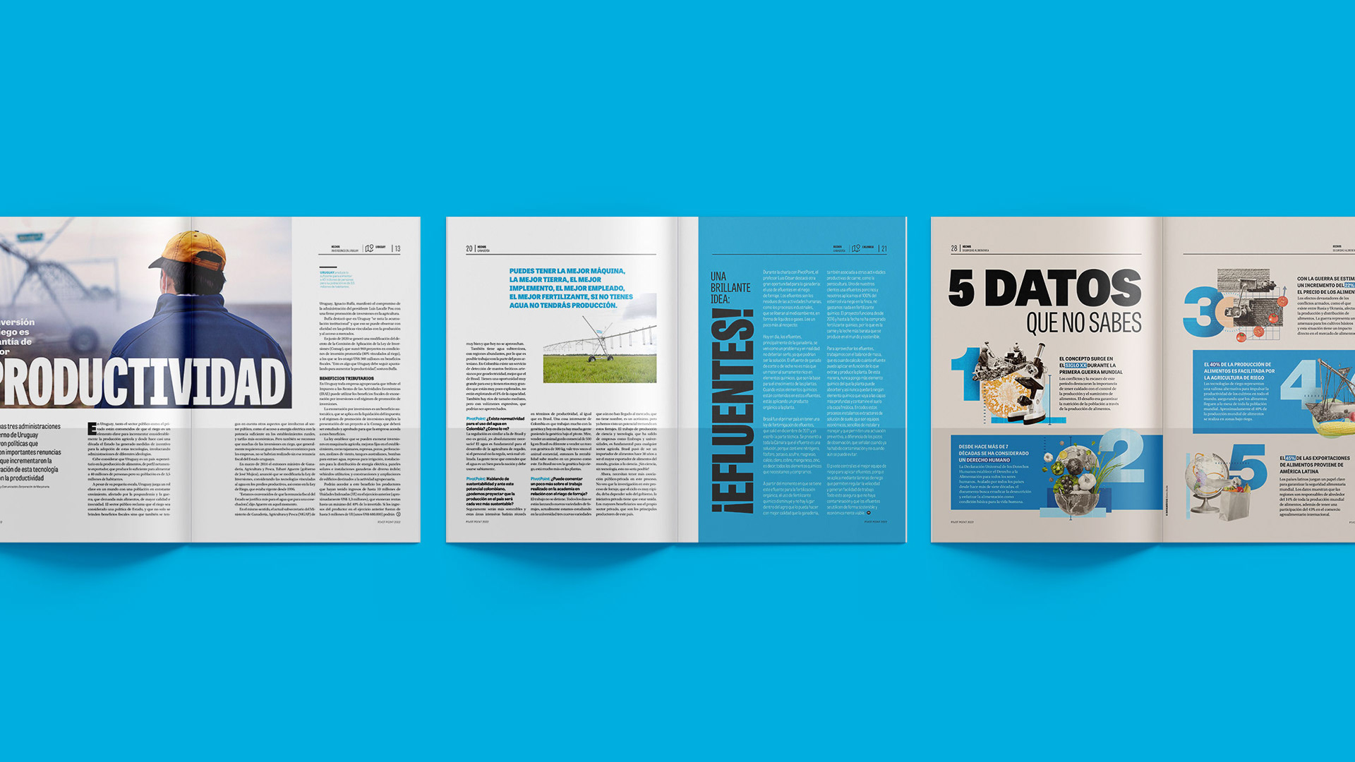
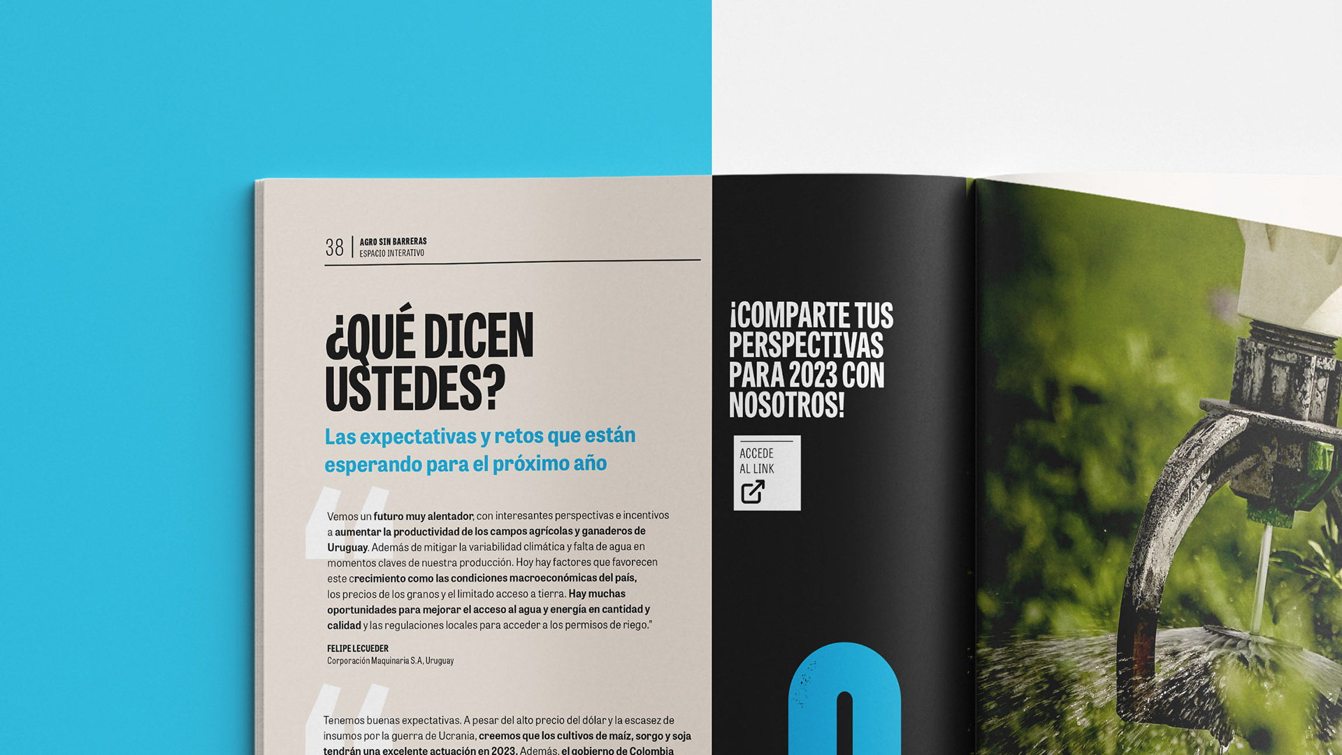
As matérias ganharam maior impacto e uma melhor hierarquia de informações, por meio da família Tablet Gothic, que confere versatilidade e peso aos títulos, além de um jogo mais moderno de sobreposição de imagens, diferentes níveis de destaque, trazendo mais pontos de atenção no layout e uma colunagem menos dura.
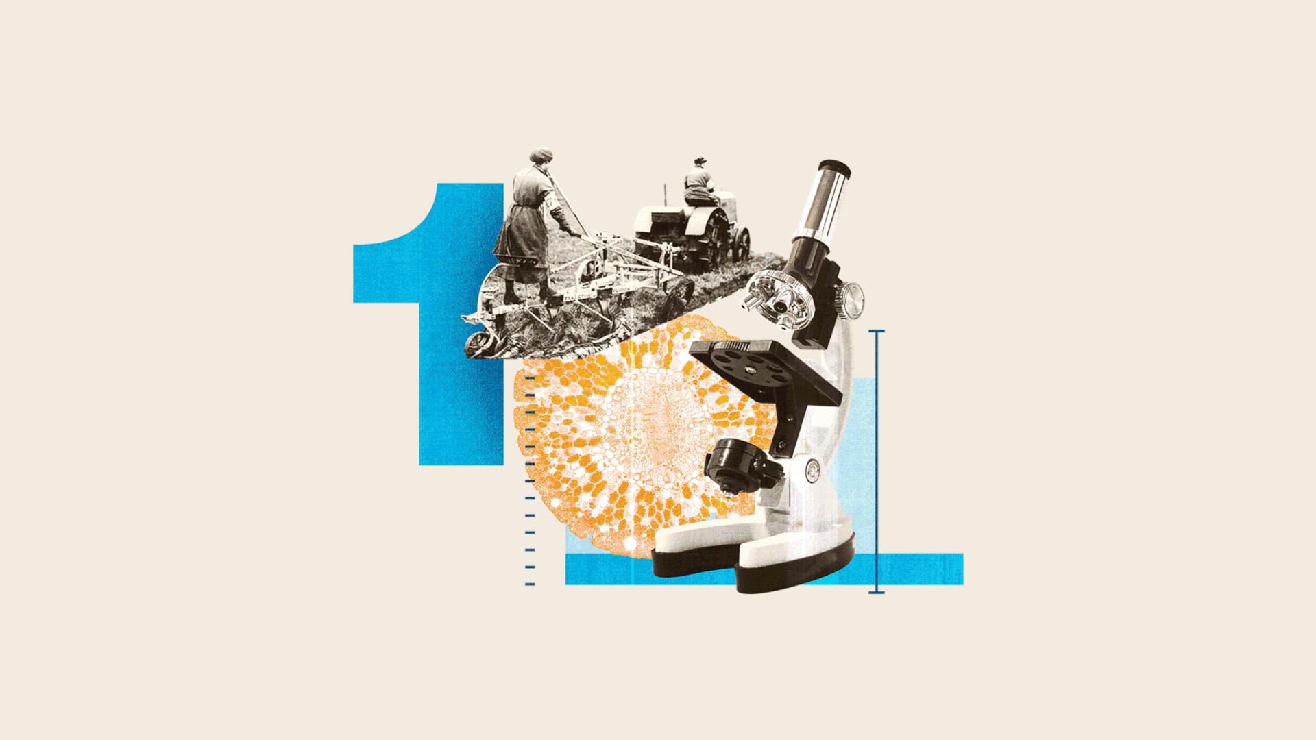
Ilustrações, colagens e números com maior peso, mergulham o leitor no conteúdo de uma maneira mais interativa e visualmente impactante.
Além do projeto, a edição 2022 também contou com a diagramação e editoração gráfica do Siamo, que podem ser conferidos na íntegra neste link.
The Pivot Point custom magazine is an initiative by Valley Irrigation, a global leader in precision irrigation systems, to engage with the agribusiness audience. The publication is part of a relationship and brand building strategy between dealers and their customers. Over the years, it has become a benchmark in its segment for delivering a consistent, reader-oriented value proposition. Its editorial line acts as a bridge between quality and relevant content and rural producers in search of knowledge to boost their businesses through technology, science and good practices. In this new graphic project developed by Siamo Studio, the main focus was to modernize the publication's language and visual resources, providing a greater connection with the brand's personality and its contents.
The cover project seeks to enhance the beauty of photographic productions that present real contexts of use of products in the field, starring real customers, with a marked use of typographic resources. The stories gained greater impact and a better hierarchy of information, through the Tablet Gothic family, which gives versatility and weight to the titles, in addition to a more modern game of image overlay, different levels of prominence, bringing more points of attention in the layout and a less stiff column. Illustrations, collages and numbers with greater weight, immerse the reader in the content in a more interactive and visually impactful way. In addition to the project, the 2022 edition also featured Siamo's layout and graphic editing, which can be seen in full at this link.